
Concept Build
Joyful Church
A design study for a vibrant, family-centric community. The goal was to bridge the gap between their high-energy Sunday experience and their digital presence.
A design study for a growing suburban church needing to transition from a cluttered information board to a welcoming digital front door.
Our Why
From Chaos to Clarity
The Challenge
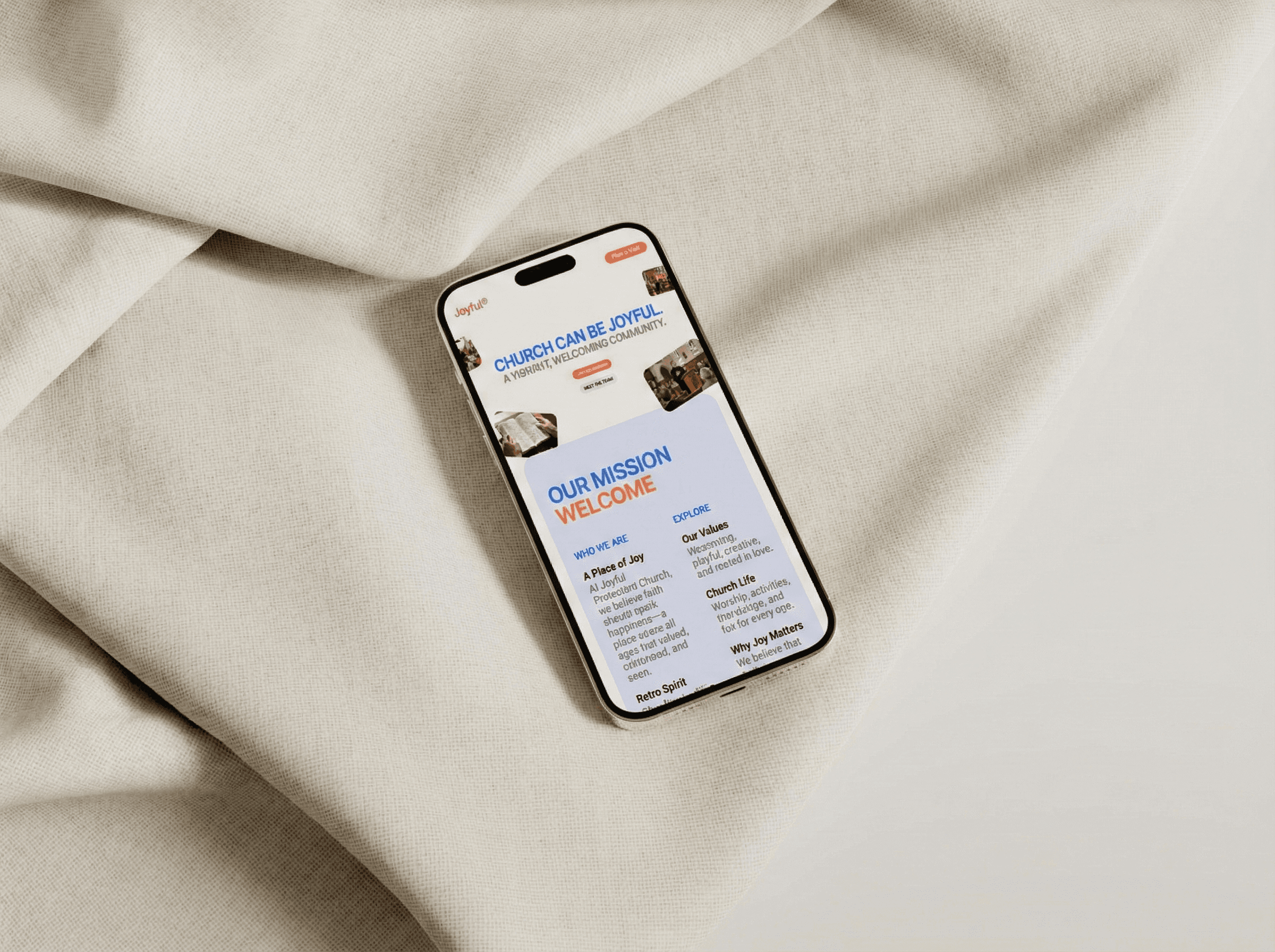
Too often, church websites feel sterile or overly corporate, failing to capture the actual life of the community. Joyful Church needed to communicate warmth, excitement, and diversity to young families. Their existing site was functional but forgot to be fun, leaving potential visitors wondering if there was any life behind the doors.
Too often, church websites feel sterile or overly corporate, failing to capture the actual life of the community. Joyful Church needed to communicate warmth, excitement, and diversity to young families. Their existing site was functional but forgot to be fun, leaving potential visitors wondering if there was any life behind the doors.
Too often, church websites feel sterile or overly corporate, failing to capture the actual life of the community. Joyful Church needed to communicate warmth, excitement, and diversity to young families. Their existing site was functional but forgot to be fun, leaving potential visitors wondering if there was any life behind the doors.
The Solution
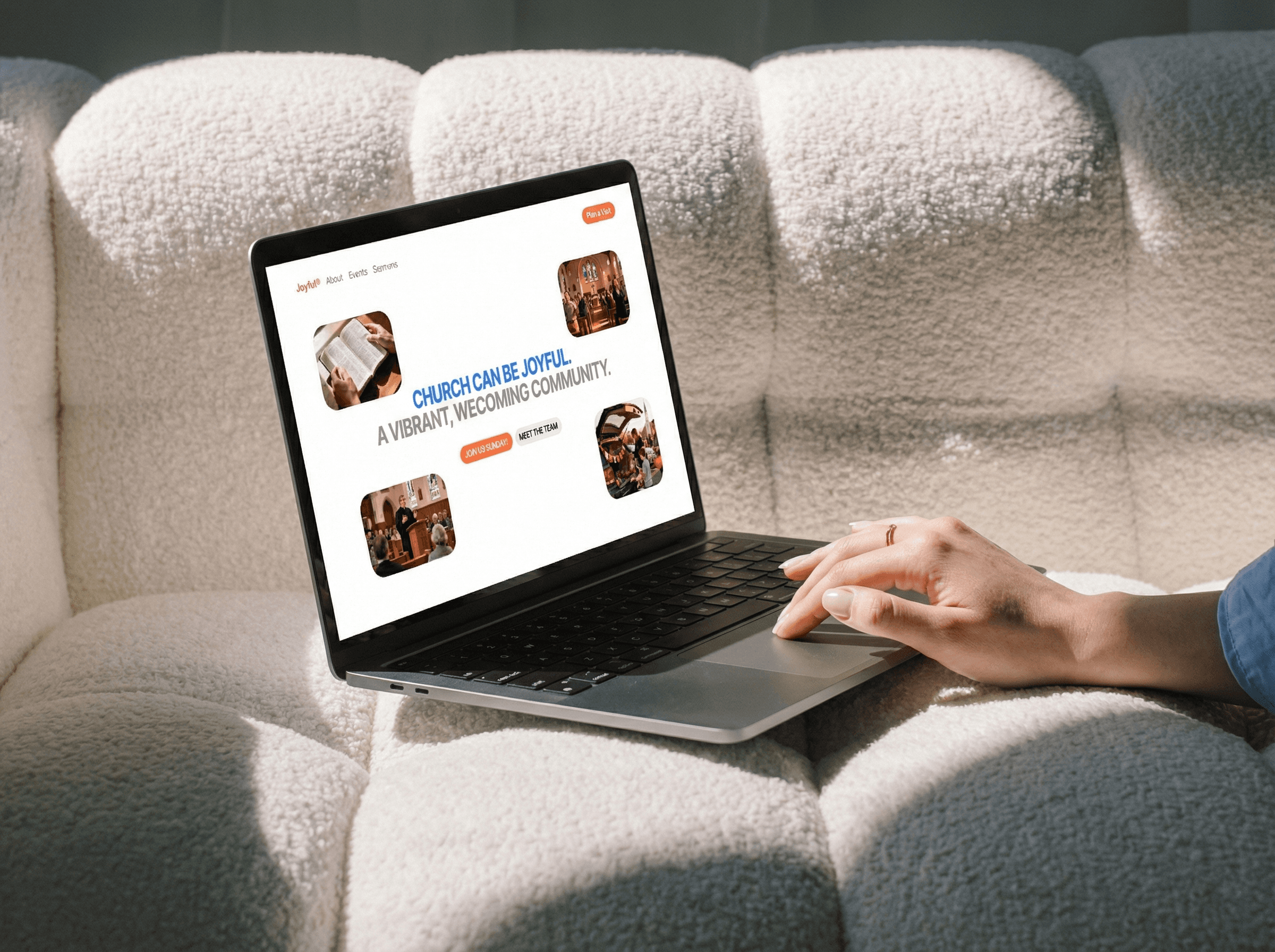
We ditched the safe neutrals for a bold, high-contrast colour palette that signals life immediately. We used rounded typography and overlapping layout elements to create a sense of movement and approachability. Strategically, we elevated “Joy Kids” to a top-tier navigation item, recognizing that for this demographic, a strong children’s ministry is the deciding factor for a first visit.
We ditched the safe neutrals for a bold, high-contrast colour palette that signals life immediately. We used rounded typography and overlapping layout elements to create a sense of movement and approachability. Strategically, we elevated “Joy Kids” to a top-tier navigation item, recognizing that for this demographic, a strong children’s ministry is the deciding factor for a first visit.
We ditched the safe neutrals for a bold, high-contrast colour palette that signals life immediately. We used rounded typography and overlapping layout elements to create a sense of movement and approachability. We moved 'Joy Kids' into the main navigation, because for young families, a strong kids' ministry is often what decides a first visit.
The Gallery
Seeing the Results
From The Client
“Go and enjoy choice food and sweet drinks, and send some to those who have nothing prepared. This day is holy to our Lord. Do not grieve, for the joy of the Lord is your strength.”
Nehemiah 8:10

Beauty Without Burnout
Designed by a youth pastor to help your ministry thrive without the burnout.
Beauty Without Burnout
Designed by a youth pastor to help your ministry thrive without the burnout.
Beauty Without Burnout
Designed by a youth pastor to help your ministry thrive without the burnout.